Key performance indicator (KPI) charts highlight single metric values typically used to measure performance or progress toward goals. Create a KPI chart to summarise the total value of a metric for a specific period, or include additional data to compare the metric’s value over time and measure it against a benchmark or target value.
💡Example use cases:
Marketing analytics: Track click-through rates to highlight email campaign performance over time.
Executive dashboarding: Measure monthly year-over-year revenue to understand how the current month’s revenue compares to the previous year benchmark.
Manufacturing analytics: Report cycle time to analyse the amount of time it takes a product to complete the manufacturing process.
Analytics Pro's KPI charts allow you to track and display metrics in various ways depending on how you configure the element properties.
Build a basic KPI chart by configuring the following element properties:
Add a chart element and designate it as a KPI chart.
💡You can also create a new KPI chart directly from a summary value in a table element. Right-click the table summary to open the menu, then select Create KPI element.
Open a workbook in Explore or Edit mode and add a new chart element.
In the Chart property, click the dropdown field and select KPI from the list.
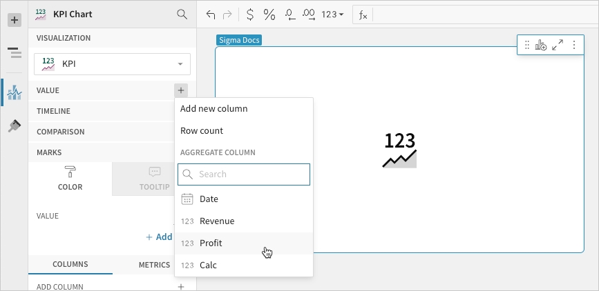
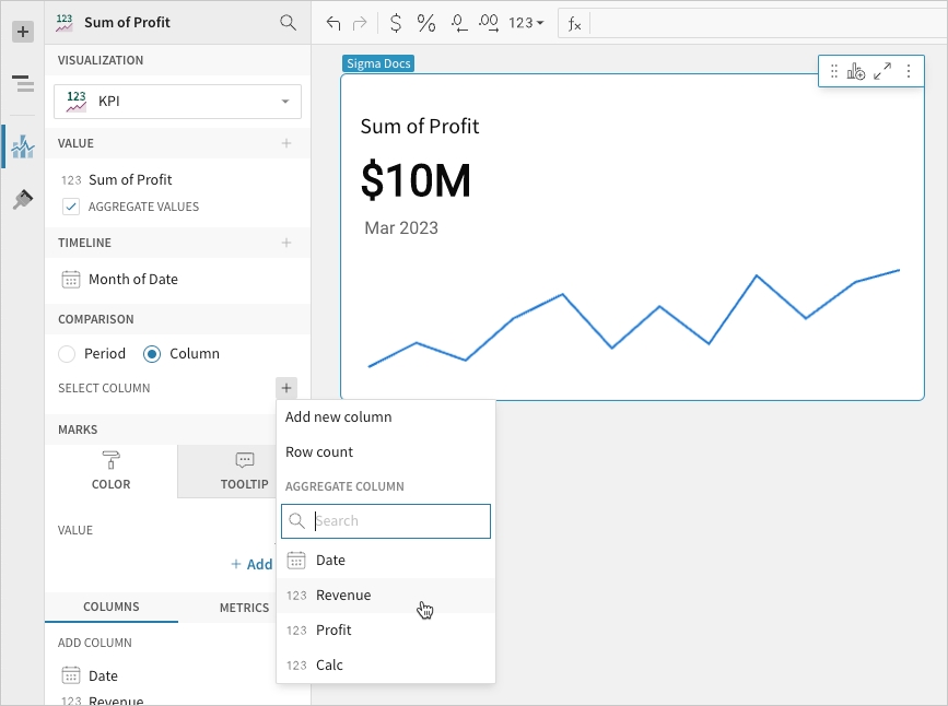
Configure the Value property to calculate the metric. This configuration is required to build any KPI chart variation.
In the Value property, click Add calculation, then use one of the following methods to calculate the metric:
To aggregate the values of an existing column, search or scroll the Aggregate column list and select the preferred column.
To add a custom calculation or value, select Add new column, then enter the calculation or value in the formula bar.
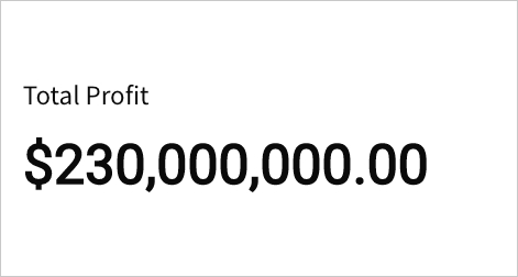
For example, you can format a sum of profit KPI to display using SI units:
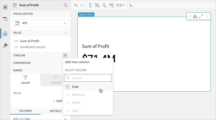
Configure the Timeline property to define the reporting period for the time series. This configuration is required to build a period value, period comparison, or benchmark period comparison KPI chart.
In the Timeline property, click Add column, then use one of the following methods to define the reporting period:
To derive the period from an existing date column, search or scroll the Select column list and select the preferred column.
To create a period based on a new date column, select Add new column, then enter a date function or value in the formula bar.
Configure the Comparison > Period property to measure a sequential or period-over-period comparison for the metric. This configuration is required to build a period comparison KPI chart.
When the benchmark or target value is null (for example, the first week in a sequential week-over-week analysis), the comparison value and label are hidden.
In the Comparison property, enable the Period option. If a source column is configured in the Timeline property, the option is automatically enabled.
Open the dropdown and select a type of period comparison.
📘Configuring a column in the Timeline property automatically engages the Comparison property. To build a KPI chart that highlights the period value of a metric without displaying a comparison, ensure the dropdown is set to None.
By default, a comparison value displays as a percentage. To instead display a delta or absolute value, customise the comparison in the Element format panel.
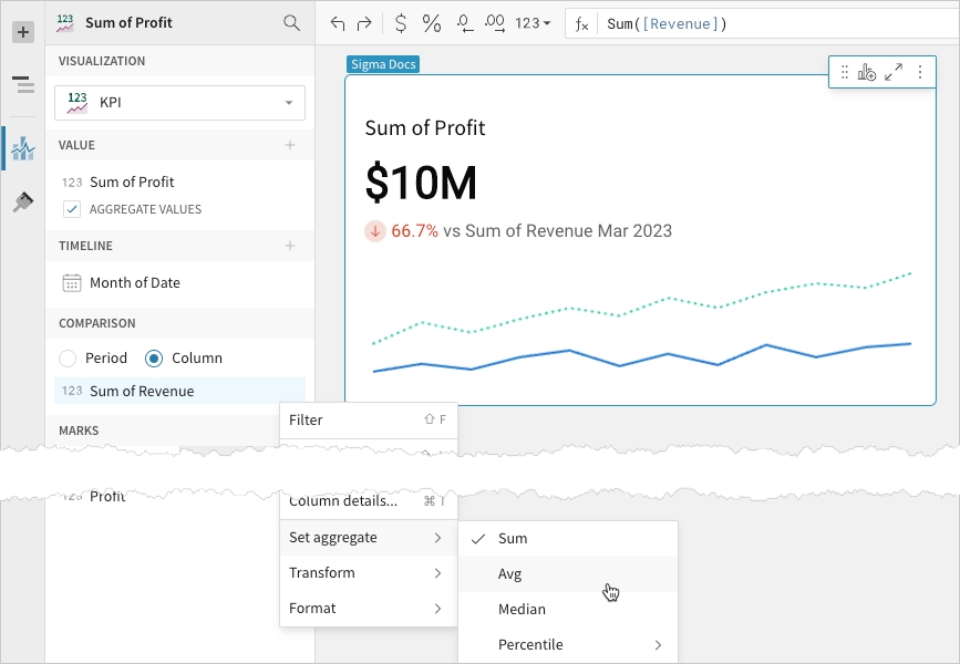
Configure the Comparison > Column property to measure the metric against a benchmark or target value. This configuration is required to build a benchmark summary comparison or benchmark period comparison KPI chart.
In the Comparison property, click Add calculation, then use one of the following methods to calculate the benchmark or target value:
To aggregate values in an existing column, search or scroll the Aggregate column list and select the preferred column.
To add a custom calculation or value, select Add new column, then enter the calculation or value in the formula bar.
Analytics Pro features various properties and format options that give you the flexibility to build detailed KPI charts.
The following sections introduce configurations that can enhance your charts and help you deliver specific insights with meaningful and actionable information.
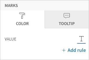
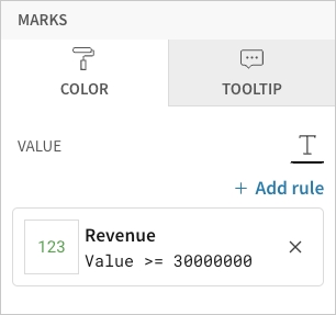
Change the metric value’s font colour in the Element properties > Marks > Colour tab. This determines the default colour of the metric value, which can be overridden by conditional formatting rules.
Configure formatting rules rules (click + Add rule) in the Element properties > Marks > Colour tab to change the metric value’s font colour according to value-based conditions. This allows you to highlight or emphasise the value when it meets the specified conditions.
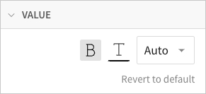
Customise the metric value’s font weight, colour, and size in the Element format > Value section.
📘The Value format settings apply to the metric value only and don’t affect the element title or comparison font. If you change the font colour in this section, the font colour is also changed in the element’s Colour property.
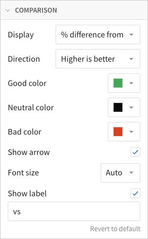
Customise the comparison display in the Element format > Comparison section.
In addition to modifying the colour indicators, you can change the font size of the comparison value, show or hide the label, and customise the label content.
You can also select the type of comparison displayed and identify the favourable direction of the comparison. The Direction setting determines when the Good colour, Neutral colour, and Bad colour indicators apply to the comparison value.
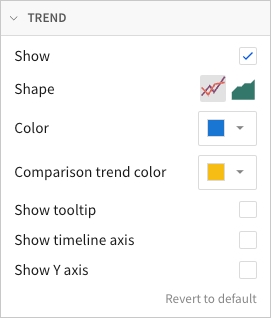
Customise the trend line in the Element format > Trend section.
In addition to showing and hiding the trend line, you can select the trend line shape (line or area) and customise its colours.
You can also enable tooltips on hover, display the x-axis with timeline tick marks and labels, and display the y-axis with grid lines and labels.
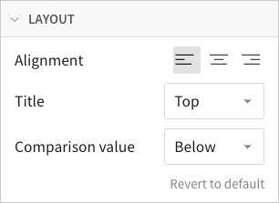
Customise the chart layout in the Element format > Layout section.
Change the alignment of the text components, and select the location of the title and comparison value.
To count the number of rows in the underlying dataset, select Row count.
💡You can also aggregate the values of an existing column by dragging and dropping a column name from the Columns list to the Value property.
When the Timeline property is not configured, the chart displays the metric's global summary value, which aggregates all data points in the resulting Value property source column. If you deselect the Aggregate values checkbox, one value from the column is selected and displayed instead of a global summary. For information about the value displayed after configuring the Timeline property, see Define the reporting period in this document.
When you add a metric, the values are automatically aggregated and the Aggregate values checkbox is selected.
[optional] If you want to control how the metric is measured and formatted, leave the Aggregate values checkbox selected and adjust the aggregate, data type, or format of the metric value using the column menu or formula toolbar:
In the Value property, hover over the column name, then click the caret () to open the column menu.
Hover over any of the following items and select the preferred option:
Set aggregate
The chart now displays the metric's latest period value, which aggregates the Value property source column data for the most recent period. To change the default display value to the global summary, proceed to the next step.
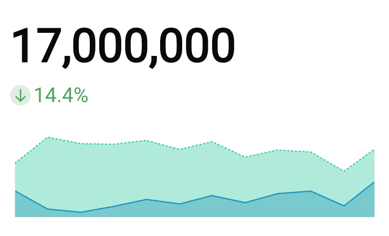
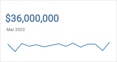
If the element layout size allows, the chart displays a trend line, which you can hover over to view previous period values. For information about how to hide the trend line, see Customise the trend line in this document.
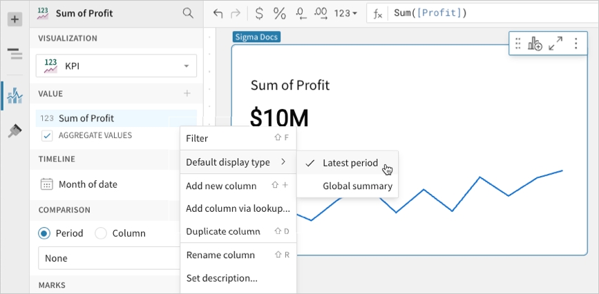
[optional] Change the default display type (the value displayed when not interacting with the trend line):
In the Value property, hover over the source column name, then click the caret () to open the column menu.
Hover over Default display type and select an option:
Latest period
Display the aggregate value for the most recent period in the time series.
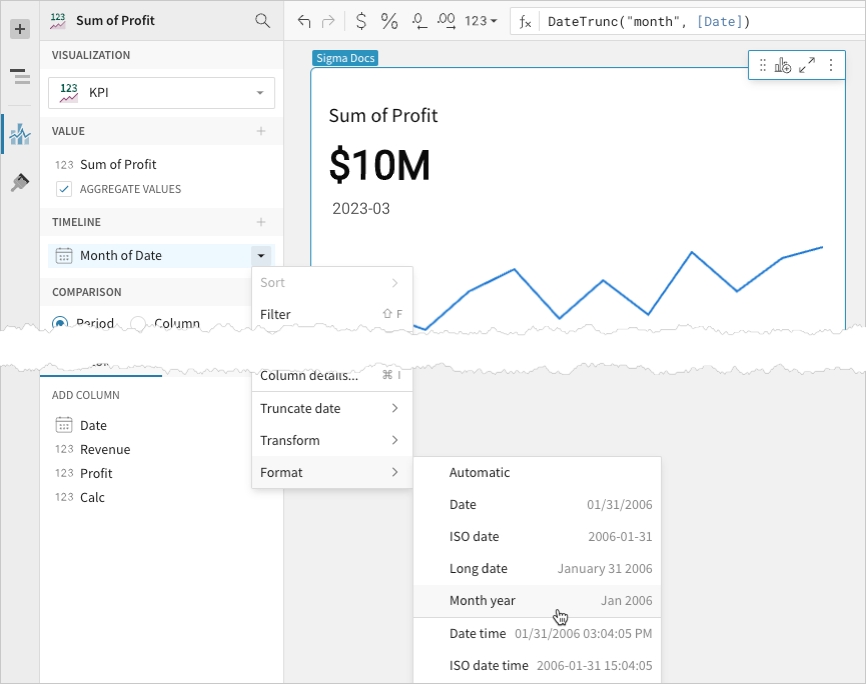
[optional] Control how the period is measured and formatted:
In the Timeline property, hover over the column name, then click the caret () to open the column menu.
Hover over any of the following items and select the preferred option:
Truncate date
Measure the metric value based on the selected period.
To count the number of rows in the underlying dataset, select Row count.
By default, a comparison value displays as a percentage. To instead display a delta or absolute value, customise the comparison in the Element format panel.
[optional] Control how the benchmark or goal is measured and formatted:
In the Comparison property, hover over the column name, then click the caret () to open the column menu.
Hover over any of the following items and select the preferred option:
Set aggregate
Measure the metric based on the selected aggregation method.
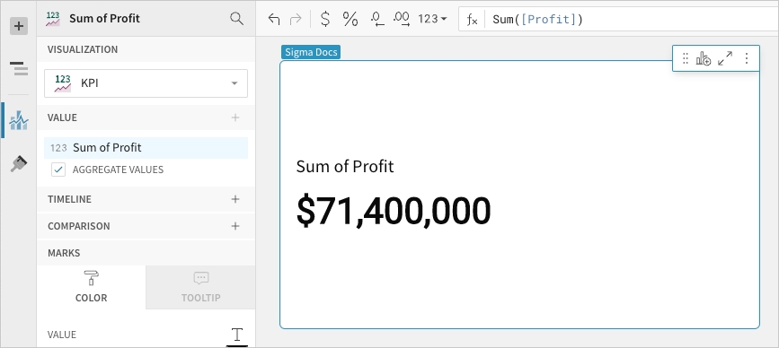
Summary value
Summarise the metric's global value to understand overall performance or magnitude.
The KPI chart highlights the global summary, which aggregates the metric values across the entire dataset.
Required element properties:
Value
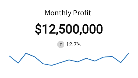
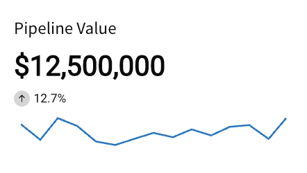
Benchmark summary comparison
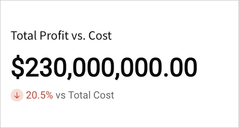
Summarise a metric's global value against a benchmark or target value. Assess relative performance and gain insight into patterns, relationships, and correlations.
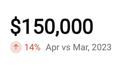
The KPI chart highlights the global summary, which aggregates the metric values across the entire dataset. It also displays a comparison as a percentage, delta, or absolute value.
Required element properties:
Value
Comparison (Column)
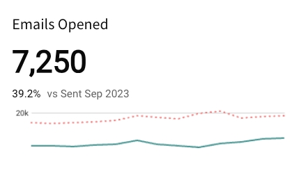
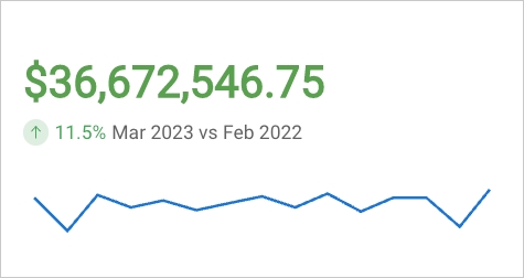
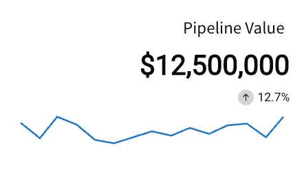
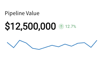
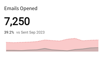
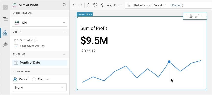
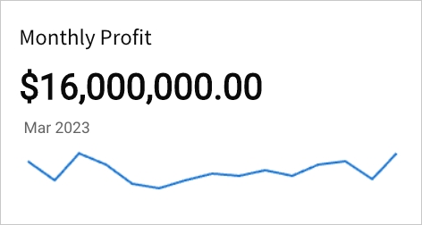
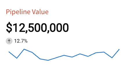
Period value
Measure a metric's period value to analyse performance during a specific time interval (like week, month, or year).
The KPI chart highlights the latest period value or global summary, and it can display a trend line that illustrates patterns and changes across sequential time periods.
Required element properties:
Value
Timeline
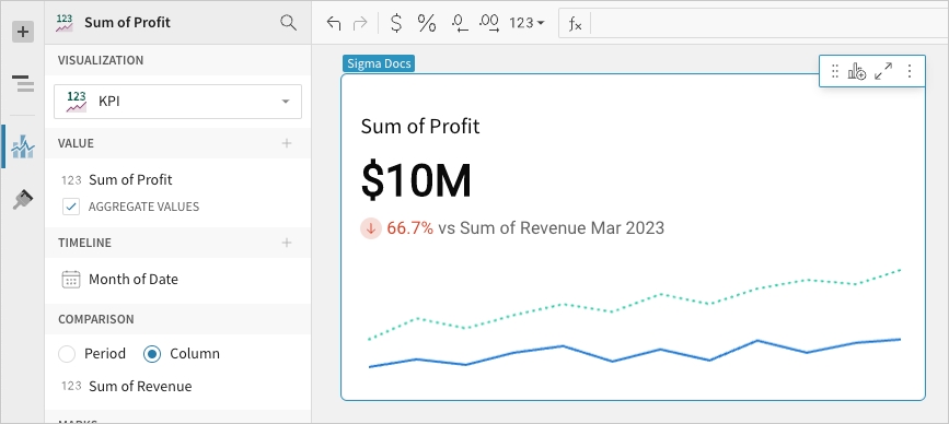
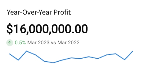
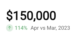
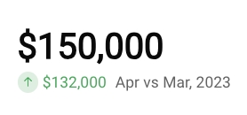
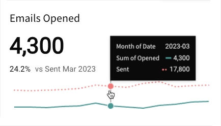
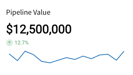
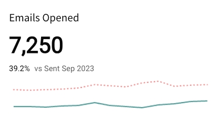
Period comparison
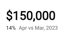
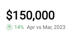
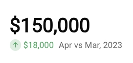
Measure a metric’s value in one period (like week, month, or year) against another to perform a sequential or period-over-period comparison.
The KPI chart highlights the latest period value or global summary, and it can display the comparison as a percentage, delta, or absolute value. It can also include a trend line that illustrates patterns and changes over time.
Required element properties:
Value
Timeline
Comparison (Period)
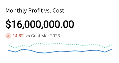
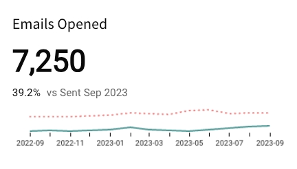
Benchmark period comparison
Compare a metric's period value against a benchmark or target to assess relative performance and gain insight into patterns, relationships, and correlations.
The KPI chart highlights the latest period value or global summary, and it can display a comparison as a percentage, delta, or absolute value. It can also include a trend line for both values to illustrate patterns and changes over time.
Required element properties:
Value
Timeline
Comparison (Column)
Chart
Chart type displayed in the workbook
Value
Calculation that determines the metric value
Timeline
Date data that defines the reporting period
Comparison
Period or calculation that defines the comparison value
% difference from
Display the percent of increase or decrease relative to the comparison value.
Difference from
Display the numerical increase or decrease relative to the comparison value.
% of
Display the percent of the comparison value.
Absolute
Display the absolute value of the comparison period or column.
Higher is better
Apply the Good colour selection to increased comparative values and the Bad colour selection to decreased comparative values.
Lower is better
Apply the Good colour selection to decreased comparative values and the Bad colour selection to increased comparative values.
None
Apply no colour indicator to the comparative value.
Line
Area
Show tooltip
Show timeline axis
Show y-axis
Left
Center
Right
Top
Bottom
Right
Below
Measure the metric based on the selected aggregation method.
Transform
Convert the column to the selected data value type.
Format
Display the metric value in the selected format.
Global summary
Display the aggregate value for all periods in the time series.
Format
Display the period date in the selected format.
Transform
Convert the column to the selected data value type.