# Combo Chart
Combo charts are a type of chart that uses a mixture of chart types. Analytics Pro combo charts support bars, lines, areas, and scatter plots.
### Plot a combo chart
To plot a combo chart, configure the following properties in the  **Element properties** tab:
| **Chart** | Chart type displayed in the workbook |
| ---------- | ------------------------------------------------------------------------------ |
| **X-axis** | Source column that defines the x-axis (horizontal axis) categories or variable |
| **Y-axis** | Source column that defines the y-axis (vertical axis) categories or variable |
The chart is empty until all properties are configured.
#### Add a combo chart to a workbook
1. Open a workbook in **Explore** or **Edit** mode and add a new chart element.
2. In the **Chart** property, click the dropdown field and select **Combo** from the list.
#### Define the x-axis categories
Configure a source column to define the x-axis categories.
1. In the **X-axis** property, click  **Add column** and select an option from the menu:
* To generate categories based on distinct values in an existing column, search or scroll the **Select column** list and select the preferred column name.
* To generate categories based on a custom formula, select **New column** and enter the formula in the toolbar.
2. \[optional] Control how the source column data is categorised and displayed in the chart:
1. Hover over the source column name, then click the caret () to open the column menu.
2. Hover over any of the following items, then select the preferred option:
| | |
| ----------------- | ------------------------------------------------------------------- |
| **Truncate date** | Categorise date values by the selected interval or unit of measure. |
| **Transform** | Convert the column to the selected data value type. |
| **Format** | Display axis and data labels in the selected format. |
#### Define the y-axis variable
Configure a source column to define the y-axis variable. Analytics Pro automatically aggregates values associated with the same x-axis category, and the aggregation type depends on the data type of the column.
By default, the first column placed on the y-axis is displayed as a bar chart and all additional columns are plotted as lines.
1. In the **Y-axis** property, click  **Add calculation** and select an option from the menu:
* To aggregate values of an existing column, search or scroll the **Aggregate column** list and select the preferred column name.
* To calculate values based on a custom formula, select **New column** and enter the formula in the toolbar.
* To count the number of rows associated with each category, select **Row count**.
2. \[optional] Control how the source column data is calculated and displayed in the chart:
1. Hover over the source column name, then click the caret () to open the column menu.
2. Hover over any of the following items, then select the preferred option:
| | |
| ----------------- | ---------------------------------------------------------- |
| **Set aggregate** | Calculate values based on the selected aggregation method. |
| **Transform** | Convert the column to the selected data value type. |
| **Format** | Display axis and data labels in the selected format. |
###
3. \[optional] Repeat the previous steps to configure multiple y-axis source columns. Analytics Pro plots each further column as a separate line series on the chart, but you can change the shape of any plotted column from the column menu.
4. \[optional] Analytics Pro auto-generates source column names and chart titles to reflect the visualised data, but you can customise these fields as needed:
* To rename a source column, double-click the column name in the **X-axis** or **Y-axis** property, then enter a new name. Changes are reflected in the default chart title.
* To edit the chart title, double-click the title in the chart, then enter a new title.
### Combo chart properties
You can configure the following properties for combo charts:
* Set up colors.
* Customise tooltip fields and values.
* Use a trellis format.
#### Configure a chart colour by category (Beta)
If your combo chart includes bars, you can set a column to use as a category and split the bar colours by category.
Configure combo chart colours in the  **Element properties** > **Marks** > **Colour** tab.
You can use colour to differentiate data, highlight specific column values, and split the chart bars by category.
| | | |
| ----------------- | ----------------------------------------------------------------------------------------------------------------------------------------------------------------------------------------- | ----------------------------------------------------------------------------------------------------------------------------------------------------------------------------------------------------------------------------------------------------------------------------------------------------------------------------------- |
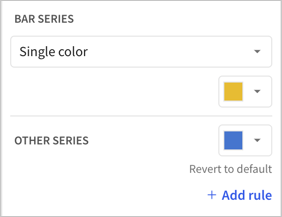
| **Single colour** | For each data series, enter a hex code or select an option from the colour palette or colour picker. |  |
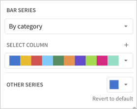
| **By category** | If your combo chart includes bars, select a source column to define colour categories for the bar series, then select or customise a colour palette for the resulting stacks or clusters. |  |
> ### 📘Multiple variables in the y-axis result in a stacked or clustered bar series in which each data series represents a measure of a different variable. The **By category** colour setting can also generate bar stacks or clusters, but the resulting series represent sub-categories within the configured chart categories that measure the same variable.
### Change the chart type for a plotted column
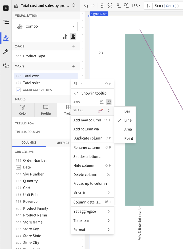
The chart type for a column plotted on a combo chart can be one of four options: bar, line, area, or scatter.
To change the chart type, do the following:
1. In the editor panel, hover over the column and click the caret .\
The column menu opens.
2. In the **Shape** submenu, choose **Bar**, **Line**, **Area**, or **Point**.\

### Format options
To begin editing a chart's format options:
**Before you start:** This action uses the editor panel. If you have not done so already, open the editor panel from either Explore or Edit mode; see Workbook modes.
1. Select  **Element format** in the side navigation.
2. Select a format option to view and edit its settings.